


Think about how you feel when you look at certain company logos. For example, seeing the Nike Swoosh makes you feel like you can conquer the world (you can do “it” whatever it might be). Or seeing the McDonald’s Golden Arches makes you reminisce about all the delicious times you spent eating there with friends or family.

How do you make your business logo stand out? Use these logo design tips!
- Make color your best friend.
- Use white space.
- Make it visible at a distance.
- Be as literal as you can.
- Keep it simple.
- Stand out.
This is how you want others to look at your company logo as well. There should be a depth of emotion invoked in anyone who interacts with the logo. The Omaha logo design tips listed in this article should help in designing a logo that does exactly that, so keep reading!
The Mcdonald’s sign pictured above was captured by our Kansas City logo design team.
1. Make Color Your Best Friend
![]() In a world of gray, black, and white, you must use color to make your logo pop out from the mundanity. It will also ensure that people will remember your logo, long after they have seen it. This could mean that your brand will the first one that will come to their mind when they need related services or products.
In a world of gray, black, and white, you must use color to make your logo pop out from the mundanity. It will also ensure that people will remember your logo, long after they have seen it. This could mean that your brand will the first one that will come to their mind when they need related services or products.
The great thing about color is that it’s a visual delight. Humans are visual creatures and color is the easiest way to bring that to the foreground.
You can use color and visual imagery together in your logo to make it pop even more. For example, having a rainbow sprinkled doughnut that’s bitten into would work well for a dessert or doughnut shop. Or having a person running in bright orange running shoes across the vista for a running gear shop.
Nineteen-year NFL veteran, Chris Bober, used color to stand out in a world of black and gray when he launched his offensive lineman academy in 2020. The Bober Academy logo is clean, simple, stands out, uses white space, and is colorful.
2. Use White Space to Make Your Logo Stand Out
Just like you would want white space on your website to ensure that any user doesn’t get overwhelmed by the words, images, and everything else, the same applies to your logo. It is possible to overdo it with a logo and have too much going on at the same time.
By sprinkling white space throughout your logo design, you can ensure that anyone looking at your logo won’t feel overstimulated by it. Minimalism is all the rage everywhere nowadays, and that applies to logo design as well.
No matter if you are making a small business logo or a logo for a not-for-profit, you can use white space or empty space to make your logo stand out even more.
Many of the recognizable Omaha logos you have seen have used white space to make the logo stand out.
3. Make It So Your Logo Is Visible at a Distance
![]()
Think about the last time you were walking through an international airport or a large shopping mall. Do you remember looking into the distance and seeing the Starbucks logo, getting excited because you can get that cup of caramel macchiato before you fly off?
That’s how discernible you want your small business logo to be as well. Someone should be able to see it at a far distance and still be able to tell that it belongs to your business. You can do this by using geometrical shapes or abstract designs. Or you could use color as mentioned earlier to make this pop-out stance happen.
The Forwardbite was designed to be seen at a distance. This wildly popular car racing brand knew it had to be easily recognizable by spectators watching car races from the stands.
4. Be as Literal as You Can
![]() When you are writing a novel that you wish to submit to the Booker Prize, it’s okay to get complicated and convoluted with your language. But when it comes to designing a logo, you want to keep it as literal as possible.
When you are writing a novel that you wish to submit to the Booker Prize, it’s okay to get complicated and convoluted with your language. But when it comes to designing a logo, you want to keep it as literal as possible.
No need to befuddle the user because they can’t figure out if that’s an ‘F’ in your logo or an ‘S’. That might even end up getting you the wrong kind of media coverage.
This is even more important when you are a global business that needs to ensure your logo makes sense to folks who aren’t necessarily born or raised in American culture. For example, Ford released a car called the Pinto in Brazil, not realizing that it means ‘chick’ in Portuguese. They had to release new campaigns to ensure their brand reputation didn’t suffer.
Big Fred’s in Omaha opened in 1964. The logo designer in Omaha got this iconic look right. A great use of white space, a pop of color, viewable from a distance, simple, and quite literal. Everyone in Omaha knows this iconic Omaha logo!
5. But Also Be as Simple as You Can Get
![]()
Again, being literal doesn’t mean that you can go crazily complicated with your logo either. Apply the KISS principle to all logo design work, that is, keep it simple, silly.
For example, if you run a cafe called the ‘Gold Spoon Eatery’, then you could introduce a gold spoon into your logo to make it stand out, to bring in color, and to be literal while keeping things simple. It can be as easy as that.
Sit down with your branding team if you have one, or hire a digital media agency in Omaha that can help you figure out what would work best with your logo design.
Nike’s iconic logo is as simple as it gets.
6. Stand Out With Your Logo, but Not Too Much
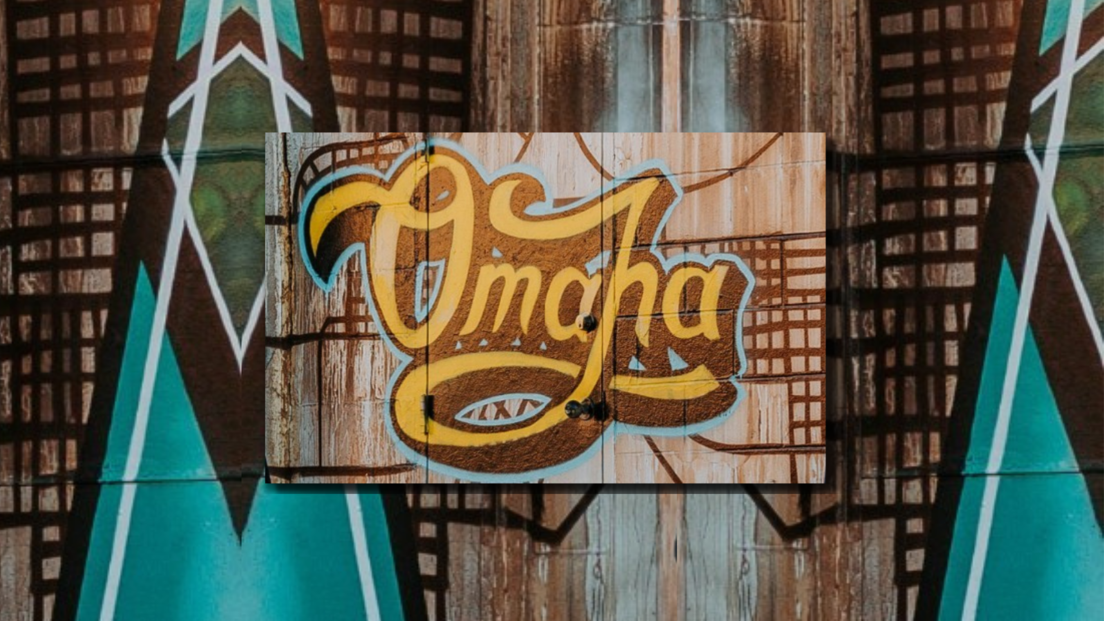
The iconic Omaha logo is painted on a building in The Old Market.
It’s okay to think outside the box when designing your logo, but again, you don’t want to stand out so much that everyone scratches their head trying to figure out what your small business logo is all about. It’s not rocket science, so don’t make it so.
You could even cheat and use your competitors when researching and designing a logo. What themes or colors stand out in the logos of your competitors? Get inspiration from them when making your own.
Choose something that you can be happy with for a long time to come since changing your logo too often can be confusing for your loyal customers and potential leads.
The iconic “Omaha” script on a downtown building personifies standing out but not too much. This Omaha logo has stood out for decades but no one thinks it’s too much. It’s become one of the most photographed murals in Omaha.
Omaha Logo Design Tips for the Ultimate Winning Logo
![]()
When designing a logo, don’t just come up with one or two designs and call it a day. You might have noticed that when you hire a logo designer or any other kind of designer, they usually come up with several design ideas to get the juices flowing.
You should do the same. If you are having a hard time with the whole process and feeling like you are making all the logo mistakes possible, then contact 316 Strategy Group in Omaha today. We specialize in creative branding and impactful Omaha logo design.
Or do you need assistance choosing a logo designer in #Omaha? Here are our tips for choosing the best logo designer in Omaha and tips on taking your branding to new heights.


